[1]:
RUN_ID="buffer_policy_aeroway_CPCAD"
[2]:
import matplotlib.pyplot as plt
plt.style.use('../RES/visual_styles/elsevier.mplstyle')
Example Visuals for BC#
load packages
[3]:
from RES.hdf5_handler import DataHandler
import RES.visuals as vis
import RES.utility as utils
import geopandas as gpd
import warnings
# Suppress specific warnings
warnings.filterwarnings("ignore", category=UserWarning)
Load Config
[4]:
from colorama import Fore, Style

cfg=utils.load_config('../config/config_CAN.yaml')
utils.print_banner(f"Supported Regions for {cfg.get('country')}")
print(Fore.YELLOW + ">> RegionCode: name <<" + Style.RESET_ALL + "\n")
for keys in cfg.get('region_mapping'):
    print(f"{keys}: {cfg.get('region_mapping').get(keys).get('name')}")
****************************
Supported Regions for Canada
****************************
>> RegionCode: name <<

AB: Alberta
BC: British Columbia
MB: Manitoba
NB: New Brunswick
NL: Newfoundland and Labrador
NS: Nova Scotia
ON: Ontario
PE: Prince Edward Island
QC: Québec
SK: Saskatchewan
Set Region
[5]:
# The tool is designed to work for WB6 regions
region_code='BC'
region_name=cfg.get('region_mapping').get(region_code).get('name') # type: ignore
utils.print_banner(f"Selected Region: {region_name} ({region_code})")
**************************************
Selected Region: British Columbia (BC)
**************************************
Load store (hdf5 file)
[6]:
store=f"../data/store/resources_{region_code}.h5"
utils.print_banner(f"Store loaded for {region_name} ({region_code})")
res_data=DataHandler(store) # the DataHandler object could be initiated without the store definition as well.
res_data.show_tree(store)
**************************************
Store loaded for British Columbia (BC)
**************************************
 └ ❌ > RES.hdf5_handler|  ❌ Error reading file: [Errno 2] Unable to synchronously open file (unable to open file: name = '../data/store/resources_BC.h5', errno = 2, error message = 'No such file or directory', flags = 0, o_flags = 0)
Load dataframes from Store#
[7]:
from RES import utility as utils

cfg=utils.load_config('../config/config_CAN.yaml')
[8]:
utils.save_to_yaml(cfg, f'../results/config_CAN_{RUN_ID}.yaml')
ℹ️ RES.utility| A copy of the dictionary saved to : '../results/config_CAN_buffer_policy_aeroway_CPCAD.yaml'
[9]:
# Loading dataframes
cells=res_data.from_store('cells')
boundary=res_data.from_store('boundary')
lines=res_data.from_store('lines')
ss=res_data.from_store('substations')
timeseries_clusters_solar=res_data.from_store('timeseries/clusters/solar')
timeseries_clusters_wind=res_data.from_store('timeseries/clusters/wind')
clusters_solar=res_data.from_store('clusters/solar')
clusters_wind=res_data.from_store('clusters/wind')
---------------------------------------------------------------------------
FileNotFoundError                         Traceback (most recent call last)
Cell In[9], line 2
      1 # Loading dataframes
----> 2 cells=res_data.from_store('cells')
      3 boundary=res_data.from_store('boundary')
      4 lines=res_data.from_store('lines')

File /local-scratch/localhome/mei3/eliasinul/work/RESource/RES/hdf5_handler.py:148, in DataHandler.from_store(self, key)
    134 def from_store(self,
    135                key: str):
    136     """
    137     Load data from the HDF5 store and handle geometry conversion.
    138
   (...)
    145         TypeError: If the loaded data is not a DataFrame or GeoDataFrame.
    146     """
--> 148     with pd.HDFStore(self.store, 'r') as store:
    149         if key not in store:
    150             utils.print_update(level=3,message=f"{__name__}| ❌ Error: Key '{key}' not found in {self.store}")

File ~/miniconda3/envs/RES/lib/python3.12/site-packages/pandas/io/pytables.py:585, in HDFStore.__init__(self, path, mode, complevel, complib, fletcher32, **kwargs)
    583 self._fletcher32 = fletcher32
    584 self._filters = None
--> 585 self.open(mode=mode, **kwargs)

File ~/miniconda3/envs/RES/lib/python3.12/site-packages/pandas/io/pytables.py:745, in HDFStore.open(self, mode, **kwargs)
    739     msg = (
    740         "Cannot open HDF5 file, which is already opened, "
    741         "even in read-only mode."
    742     )
    743     raise ValueError(msg)
--> 745 self._handle = tables.open_file(self._path, self._mode, **kwargs)

File ~/miniconda3/envs/RES/lib/python3.12/site-packages/tables/file.py:296, in open_file(filename, mode, title, root_uep, filters, **kwargs)
    291             raise ValueError(
    292                 "The file '%s' is already opened.  Please "
    293                 "close it before reopening in write mode." % filename)
    295 # Finally, create the File instance, and return it
--> 296 return File(filename, mode, title, root_uep, filters, **kwargs)

File ~/miniconda3/envs/RES/lib/python3.12/site-packages/tables/file.py:746, in File.__init__(self, filename, mode, title, root_uep, filters, **kwargs)
    743 self.params = params
    745 # Now, it is time to initialize the File extension
--> 746 self._g_new(filename, mode, **params)
    748 # Check filters and set PyTables format version for new files.
    749 new = self._v_new

File ~/miniconda3/envs/RES/lib/python3.12/site-packages/tables/hdf5extension.pyx:396, in tables.hdf5extension.File._g_new()

File ~/miniconda3/envs/RES/lib/python3.12/site-packages/tables/utils.py:166, in check_file_access(filename, mode)
    163 if mode == 'r':
    164     # The file should be readable.
    165     if not os.access(path, os.F_OK):
--> 166         raise FileNotFoundError(f"``{path}`` does not exist")
    167     if not path.is_file():
    168         raise IsADirectoryError(f"``{path}`` is not a regular file")

FileNotFoundError: ``/local-scratch/localhome/mei3/eliasinul/work/RESource/data/store/resources_BC.h5`` does not exist
Create Visuals#
[ ]:
cells.columns
Index(['x', 'y', 'Country', 'Province', 'Region', 'geometry',
       'potential_capacity_wind', 'capex_wind', 'fom_wind', 'vom_wind',
       'grid_connection_cost_per_km_wind', 'tx_line_rebuild_cost_wind',
       'Operational_life_wind', 'windspeed_ERA5', 'x_1', 'y_1',
       'windspeed_gwa', 'CF_IEC2', 'CF_IEC3', 'IEC_Class_ExLoads',
       'wind_CF_mean', 'nearest_station', 'nearest_station_distance_km',
       'lcoe_wind', 'potential_capacity_solar', 'capex_solar', 'fom_solar',
       'vom_solar', 'grid_connection_cost_per_km_solar',
       'tx_line_rebuild_cost_solar', 'Operational_life_solar', 'solar_CF_mean',
       'lcoe_solar'],
      dtype='object')
Exclusion Layers#
[ ]:
from RES import visuals as vis
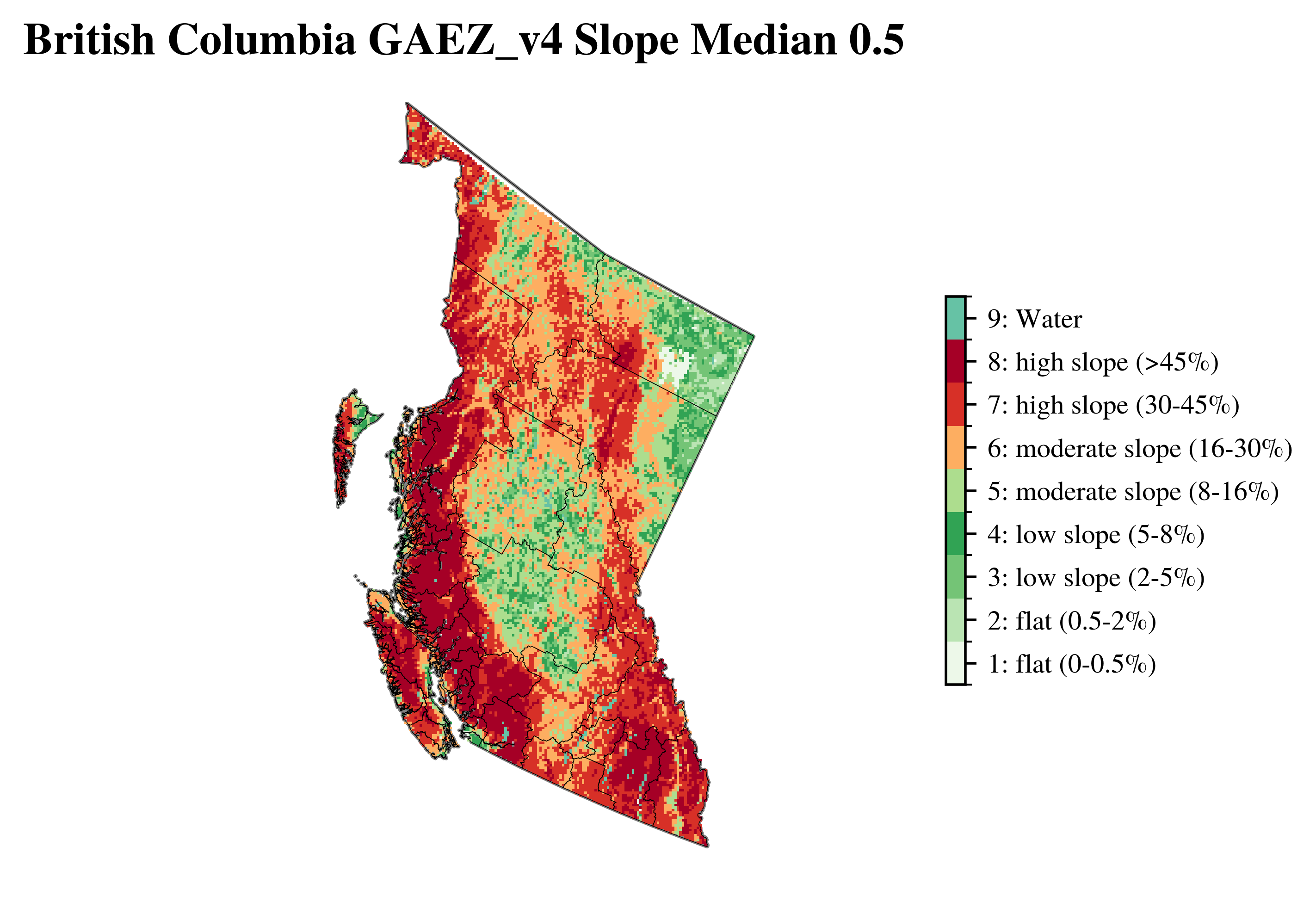
vis.plot_gaez_raster_with_boundary(
raster_path=f"../data/downloaded_data/GAEZ/Rasters_in_use/LR/ter/{region_code}_slpmed05.tif",
legend_csv="../data/gaez_slpmed05_legend.csv",
gdf_path=f"../data/processed_data/regions/gadm41_Canada_L2_{region_code}.geojson",
dst_crs="EPSG:3347",
figsize=(7, 4),
compass_length=0.04,
title=f"{region_name} GAEZ_v4 Slope Median 0.5",
plot_save_to=f"../vis/{region_code}/lands/{region_name}_slpmed05.png"
)
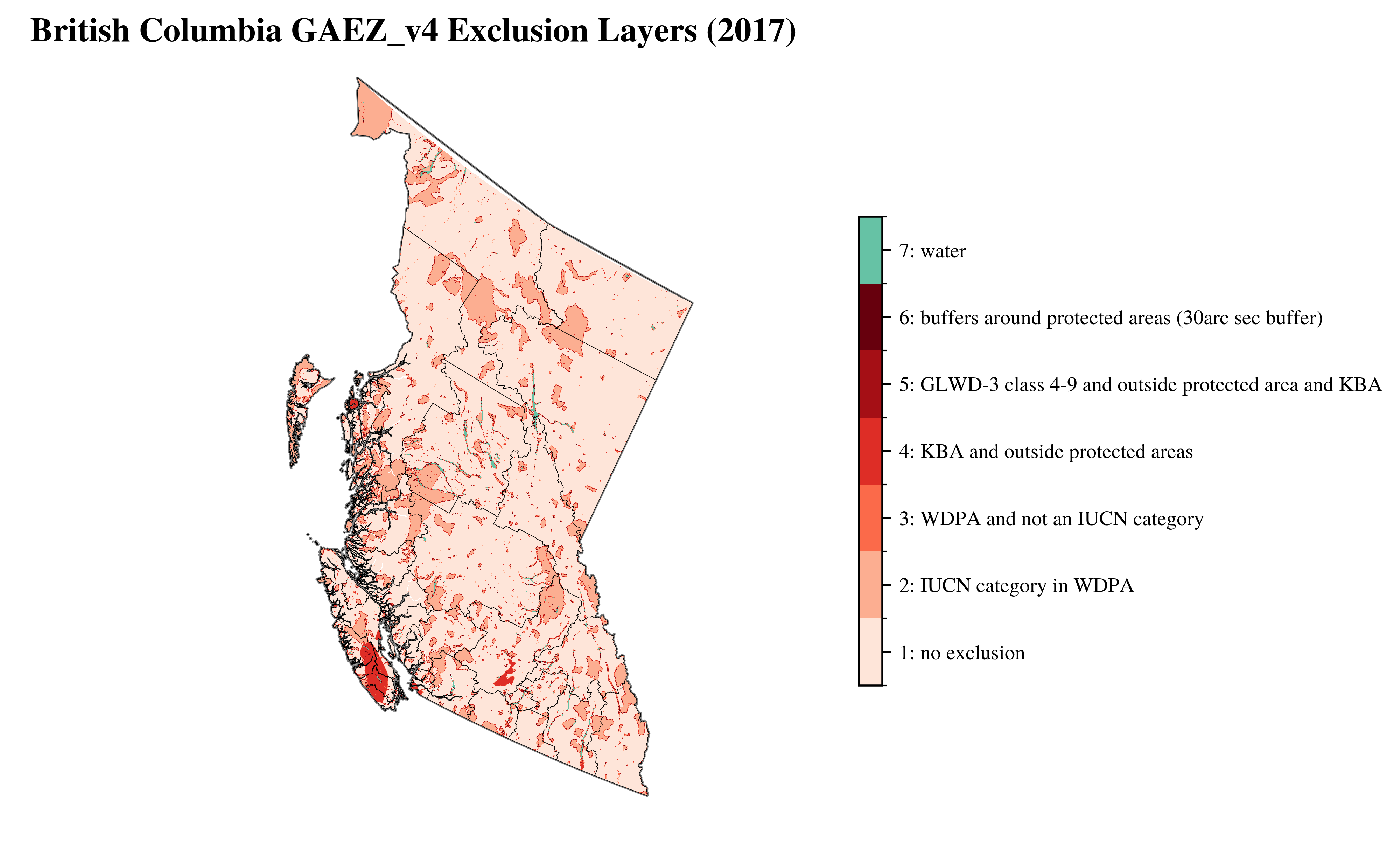
vis.plot_gaez_raster_with_boundary(
raster_path=f"../data/downloaded_data/GAEZ/Rasters_in_use/LR/excl/{region_code}_exclusion_2017.tif",
legend_csv="../data/exclusion_2017_legend.csv",
gdf_path=f"../data/processed_data/regions/gadm41_Canada_L2_{region_code}.geojson",
dst_crs="EPSG:3347",
figsize=(8, 6),
compass_length=0.06,
title=f"{region_name} GAEZ_v4 Exclusion Layers (2017)",
plot_save_to=f"../vis/{region_code}/lands/{region_name}_exclusion_2017.png"
)
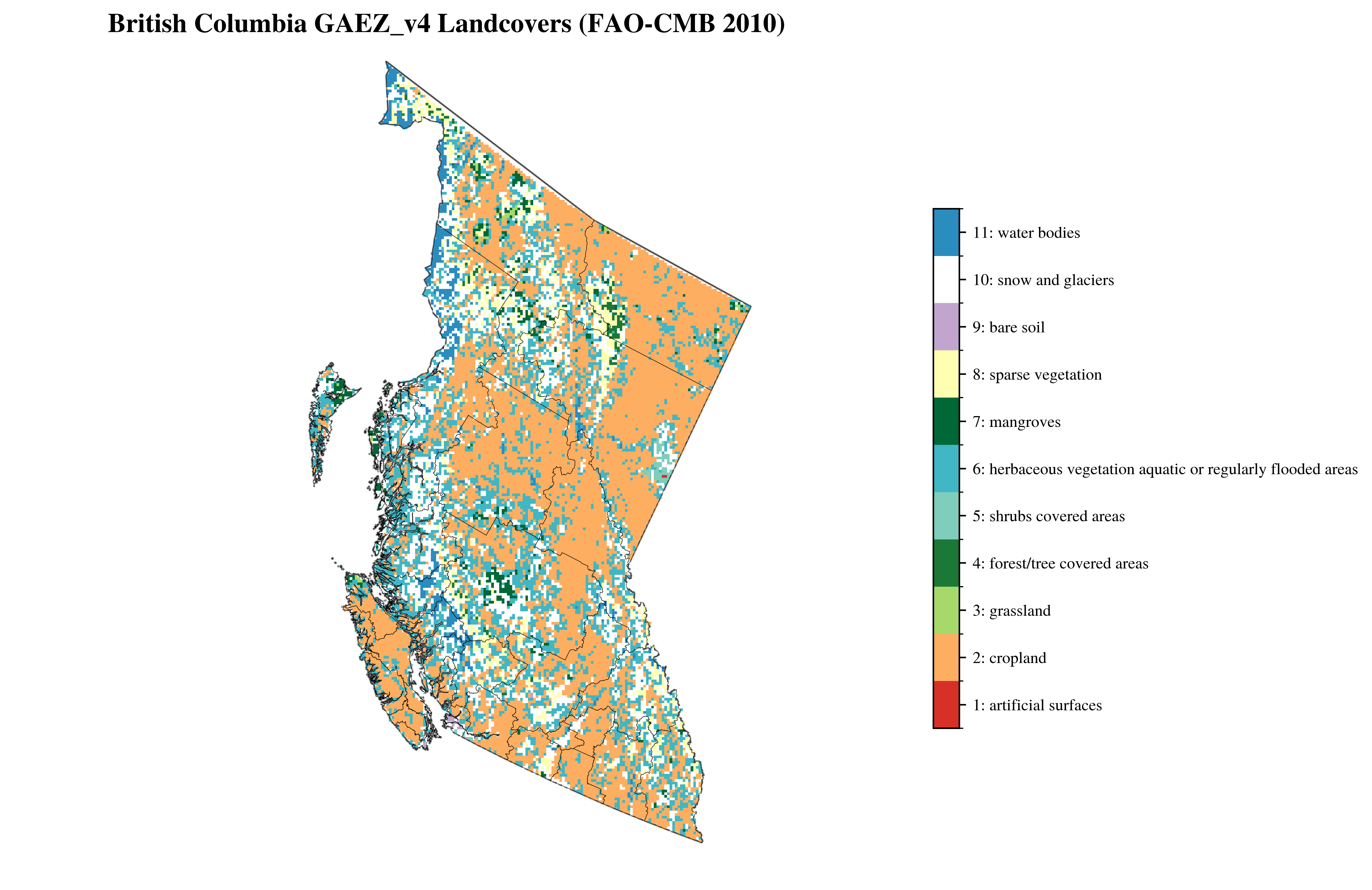
vis.plot_gaez_raster_with_boundary(
raster_path=f"../data/downloaded_data/GAEZ/Rasters_in_use/LR/lco/{region_code}_faocmb_2010.tif",
legend_csv="../data/faocmb_2010_legend.csv",
gdf_path=f"../data/processed_data/regions/gadm41_Canada_L2_{region_code}.geojson",
figsize=(10, 8),
dst_crs="EPSG:3347",
compass_length=0.06,
title=f"{region_name} GAEZ_v4 Landcovers (FAO-CMB 2010)",
plot_save_to=f"../vis/{region_code}/lands/{region_name}_faocmb_2010.png"
)
 └> GAEZ Raster plot saved to ../vis/BC/lands/British Columbia_slpmed05.png
 └> GAEZ Raster plot saved to ../vis/BC/lands/British Columbia_exclusion_2017.png
 └> GAEZ Raster plot saved to ../vis/BC/lands/British Columbia_faocmb_2010.png
Grid#
[ ]:
# for columns in lines.columns:
#     print(f"{columns}")
lines#
[ ]:
# vis.plot_grid_lines(
#     region_code=region_code,
#     region_name=region_name,
#     lines=lines,
#     boundary=boundary,
#     save_to=f"vis/{region_code}",
#     font_family=font_family,
#     show=True
# )
Substations#
[ ]:
# <code>
Resources#
Capacity Factor Map#
Individual Maps
[ ]:
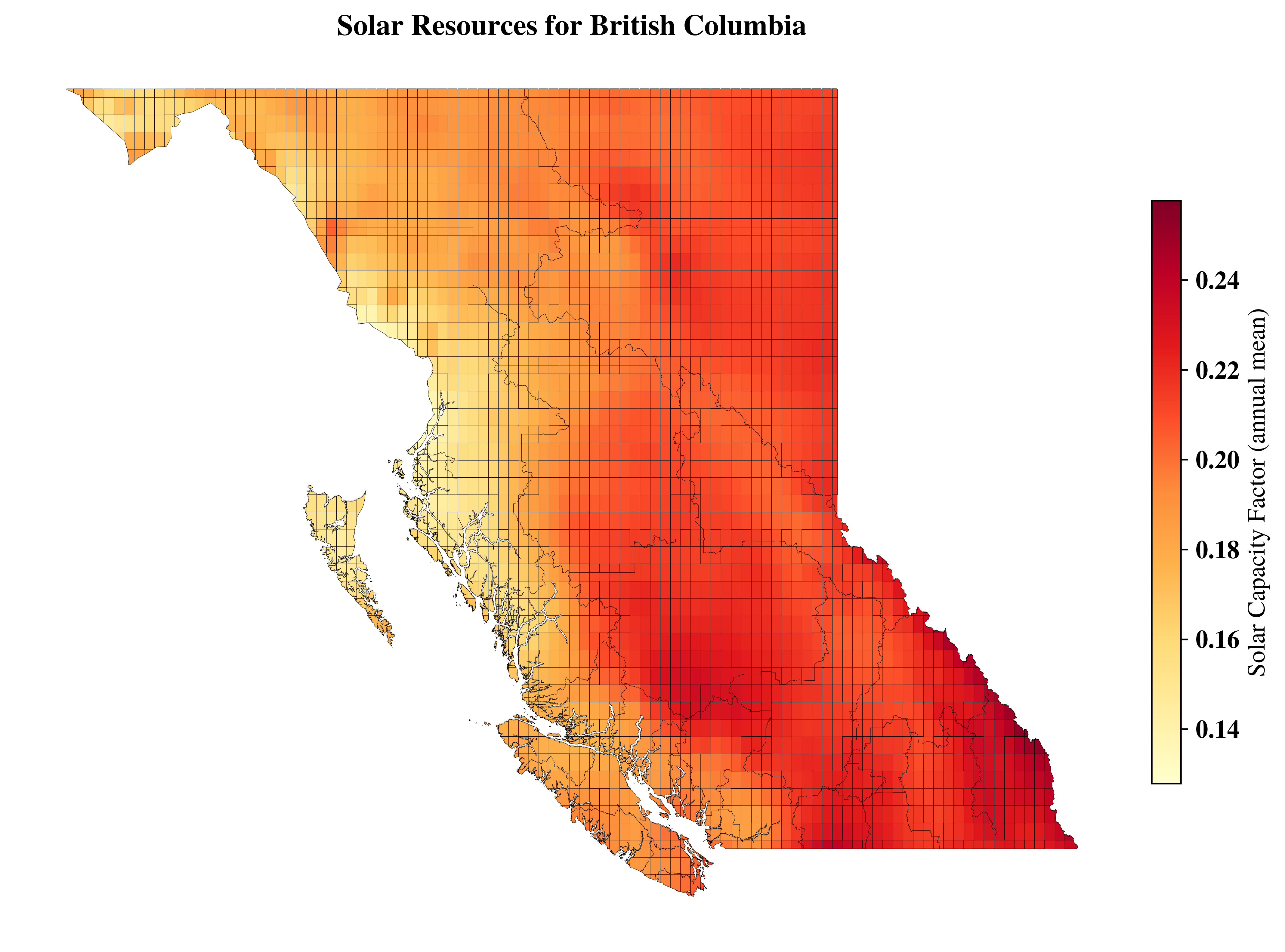
vis.get_data_in_map_plot(cells=cells,
                resource_type='solar',
                datafield='CF',
                title=f"Solar Resources for {region_name}",
                # ax=ax1,
                # font_family='sans-serif',
                show=False)
└> Please cross check with Solar CF map with GLobal Solar Atlas Data from : https://globalsolaratlas.info/download/country_name
<Axes: title={'center': 'Solar Resources for British Columbia'}>
[ ]:
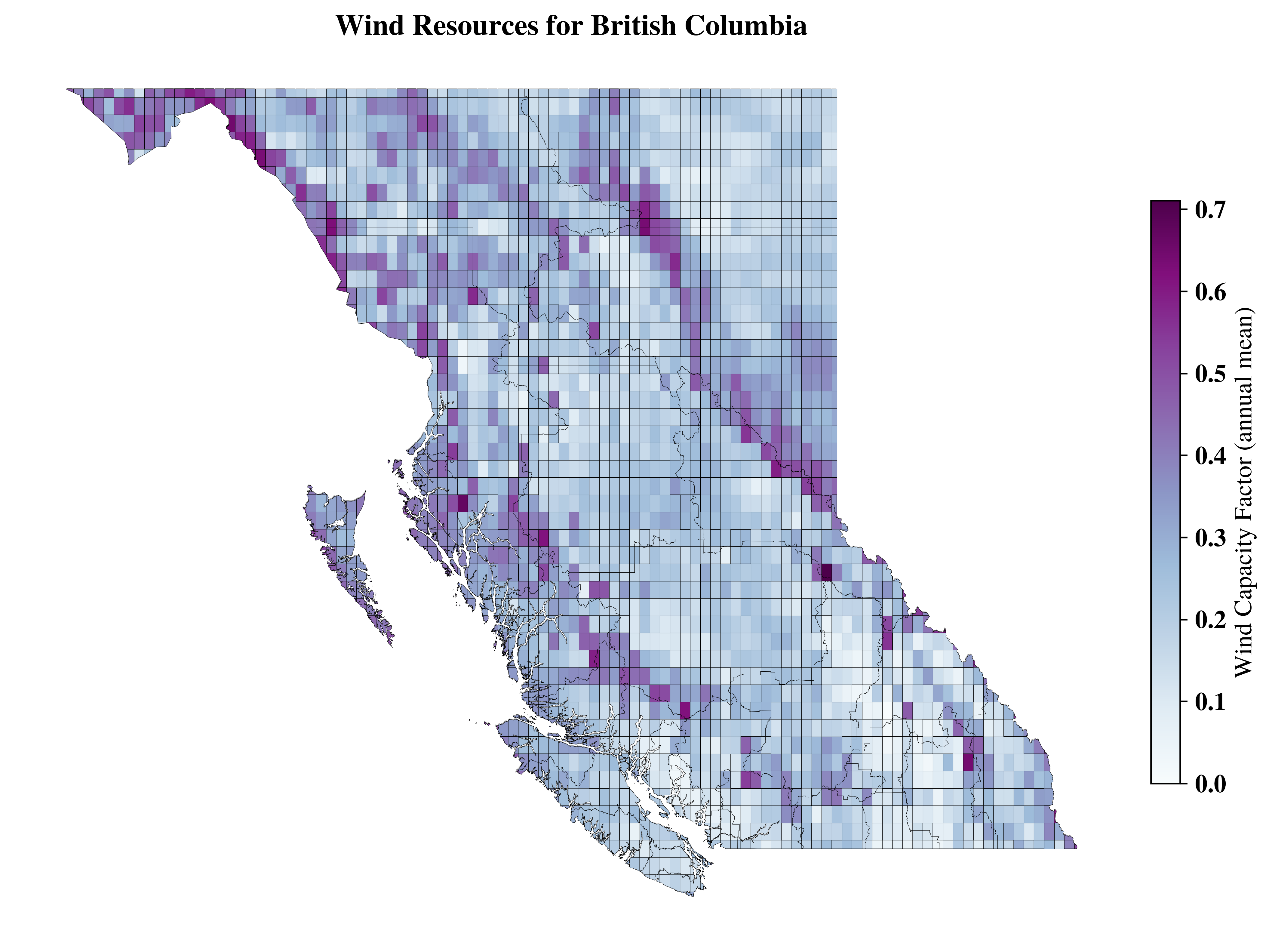
vis.get_data_in_map_plot(cells,
                resource_type='wind',
                  datafield='CF',
                title=f"Wind Resources for {region_name}",
                # ax=ax1,
                show=False)
<Axes: title={'center': 'Wind Resources for British Columbia'}>
Combined Map
[ ]:
import matplotlib.pyplot as plt

fig, (ax1, ax2) = plt.subplots(1, 2, figsize=(12, 4.5), dpi=500)
# for double coulmn figure at 500 Dpi (72points per inch) minimum wide required is 3750 px, hence figsize=(7.5, 5) is recommended

fig.suptitle(f"Resources for {region_name}", fontsize=18, fontweight='bold')

vis.get_data_in_map_plot(cells,
                resource_type='solar',
                datafield='CF',
                ax=ax1,
                show=False)
vis.get_data_in_map_plot(cells,
                resource_type='wind',
                datafield='CF',
                ax=ax2,
                show=False)

plt.tight_layout()
plt.savefig(f"../vis/{region_code}/Resources_combined_CF.png", bbox_inches='tight', transparent=False)
plt.savefig("../docs/source/_static/Resources_combined_CF.png", bbox_inches='tight', transparent=False)
└> Please cross check with Solar CF map with GLobal Solar Atlas Data from : https://globalsolaratlas.info/download/country_name
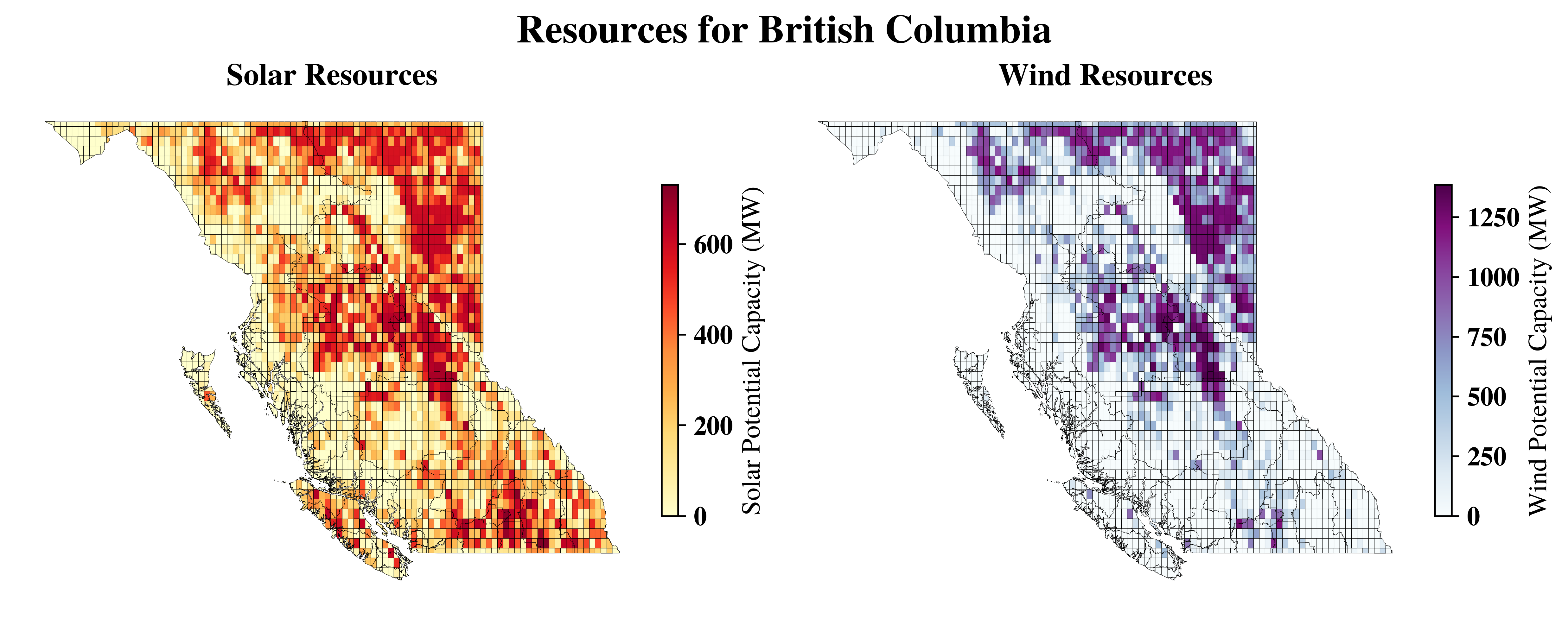
Capacity#
[ ]:
# vis.get_data_in_map_plot(cells,
#                 resource_type='solar',
#                 datafield='capacity',
#                 # ax=ax1,
#                 show=False)
[ ]:
import matplotlib.pyplot as plt

fig, (ax1, ax2) = plt.subplots(1, 2, figsize=(10, 4), dpi=500)
# for double coulmn figure at 500 Dpi (72points per inch) minimum wide required is 3750 px, hence figsize=(7.5, 5) is recommended

fig.suptitle(f"Resources for {region_name}", fontsize=18, fontweight='bold')

vis.get_data_in_map_plot(cells,
                resource_type='solar',
                datafield='capacity',
                ax=ax1,
                show=False)
vis.get_data_in_map_plot(cells,
                resource_type='wind',
                datafield='capacity',
                ax=ax2,
                show=False)

plt.tight_layout()

plt.savefig(f"../vis/{region_code}/Resources_combined_CAPACITY.png", bbox_inches='tight', transparent=False)
plt.savefig("../docs/source/_static/Resources_combined_CAPACITY.png", bbox_inches='tight', transparent=False)
└> Please cross check with Solar CF map with GLobal Solar Atlas Data from : https://globalsolaratlas.info/download/country_name
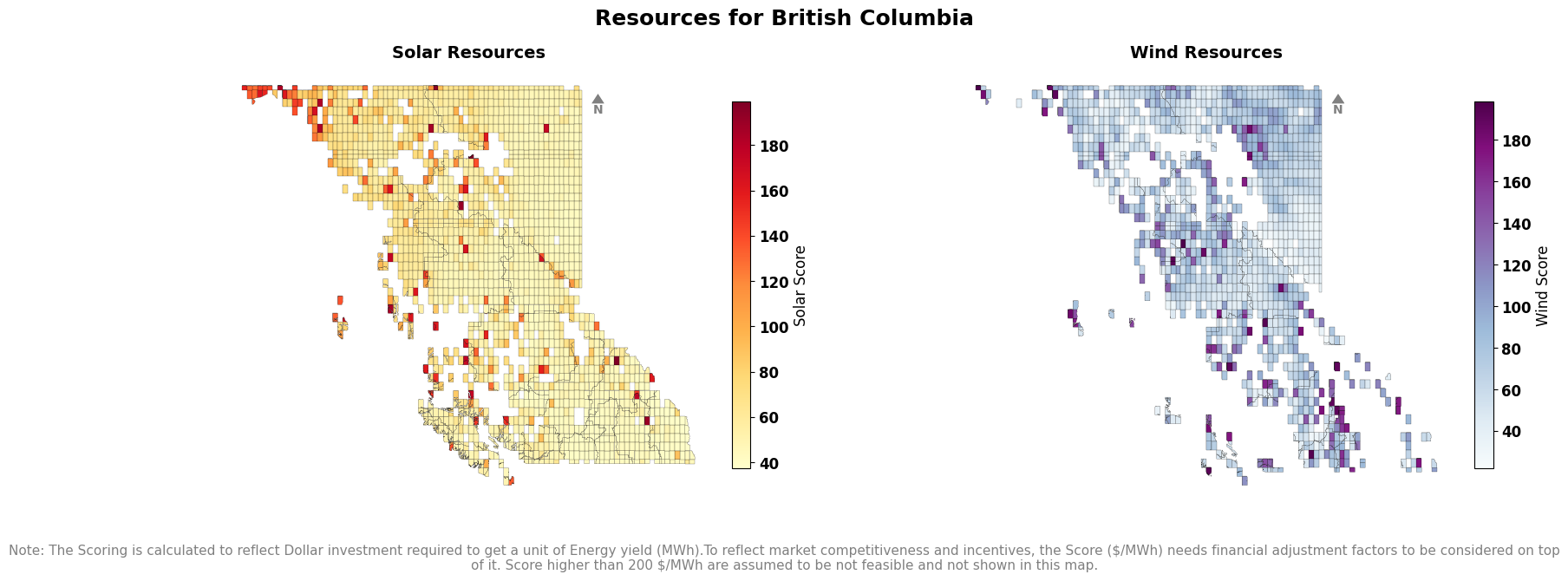
Score#
[ ]:
# vis.get_data_in_map_plot(cells,
#                 resource_type='solar',
#                 datafield='score',
#                 # ax=ax1,
#                 show=False)
[ ]:
import matplotlib.pyplot as plt

fig, (ax1, ax2) = plt.subplots(1, 2, figsize=(9, 3.5), dpi=500)
# for double coulmn figure at 500 Dpi (72points per inch) minimum wide required is 3750 px, hence figsize=(7.5, 5) is recommended

fig.suptitle(f"Resources for {region_name}", fontsize=18, fontweight='bold')

vis.get_data_in_map_plot(cells,
                resource_type='solar',
                datafield='score',
                compass_size=12,
                ax=ax1,
                show=False)
vis.get_data_in_map_plot(cells,
                resource_type='wind',
                datafield='score',
                ax=ax2,
                show=False)
fig.text(
    0.5, -0.05,
    "Note: The Scoring is calculated to reflect Dollar investment required to get a unit of Energy yield (MWh).To reflect market competitiveness and incentives, the Score (CAD/MWh) needs financial adjustment factors to be considered on top of it. Score higher than 200 $/MWh are assumed to be not feasible and not shown in this map.",
    ha='center', va='top', fontsize=9, color='gray',wrap=True,
)
plt.tight_layout()

plt.savefig(f"../vis/{region_code}/Resources_combined_SCORE.png", bbox_inches='tight', transparent=False)
plt.savefig("../docs/source/_static/Resources_combined_SCORE.png", bbox_inches='tight', transparent=False)
└> Please cross check with Solar CF map with GLobal Solar Atlas Data from : https://globalsolaratlas.info/download/country_name
Capacity Plot (bins)#
Not required for now
[ ]:
# import matplotlib.pyplot as plt
# import pandas as pd

# legend_x_ax_offset=1.1

# # Ensure 'Region' is in the columns for both boundary and cells
# # if boundary is not None and ('Region' not in boundary.columns or 'Country' not in boundary.columns):
# #     boundary = boundary.reset_index()

# # Assign a number to each region
# # boundary['Region_Number'] = range(1, len(boundary) + 1)

# # Define custom bins and labels for solar and wind capacity
# solar_bins = [0, 100, 200, 300, 500, float('inf')]  # Custom ranges
# solar_labels = ['<100','100-200', '200-300', '300-500','>500']  # Labels for legend

# # Define custom bins and labels for solar and wind capacity
# wind_bins = [0, 300, 500, 1000, 2000,3000, float('inf')]  # Custom ranges
# wind_labels = ['<300','300-500', '500-1000', '1000-2000','2000-3000', '>3000']  # Labels for legend

# # Categorize potential_capacity_solar and potential_capacity_wind into bins
# clusters_solar['solar_category'] = pd.cut(clusters_solar['potential_capacity'], bins=solar_bins, labels=solar_labels, include_lowest=True)
# clusters_wind['wind_category'] = pd.cut(clusters_wind['potential_capacity'], bins=wind_bins, labels=wind_labels, include_lowest=True)

# # Create figure and axes for side-by-side plotting
# fig, (ax1, ax2) = plt.subplots(figsize=(18, 8), ncols=2)
# fig.suptitle("Potential Sites for Targeted Capacity Investments", fontsize=16,weight='bold')
# # Set axis off for both subplots
# ax1.set_axis_off()
# ax2.set_axis_off()

# # Shadow effect offset
# shadow_offset = 0.01

# # Plot solar map on ax1
# # Add shadow effect for solar map
# boundary.geometry = boundary.geometry.translate(xoff=shadow_offset, yoff=-shadow_offset)
# boundary.plot(ax=ax1, color='None', edgecolor='grey', linewidth=1, alpha=0.7)  # Shadow layer
# boundary.geometry = boundary.geometry.translate(xoff=-shadow_offset, yoff=shadow_offset)

# # Plot solar cells
# clusters_solar.plot(column='solar_category', ax=ax1, cmap='Wistia', legend=True,
#            legend_kwds={'title': "Solar Capacity (MW)", 'loc': 'upper right','fontsize':12,'bbox_to_anchor':(legend_x_ax_offset,1), 'frameon': False})

# # Plot actual boundary for solar map
# # boundary.plot(ax=ax1, facecolor='none', edgecolor='black', linewidth=0.2, alpha=0.7)
# """
# # Annotate region numbers for solar map
# for idx, row in boundary.iterrows():
#     centroid = row.geometry.centroid
#     ax1.annotate(f"{row['Region_Number']}",
#                  xy=(centroid.x, centroid.y),
#                  ha='center', va='center',
#                  fontsize=7, color='black',
#                  bbox=dict(facecolor='white', edgecolor='none', alpha=0.7, boxstyle='round,pad=0.2'))
# """
# # Plot wind map on ax2
# # Add shadow effect for wind map
# boundary.geometry = boundary.geometry.translate(xoff=shadow_offset, yoff=-shadow_offset)
# boundary.plot(ax=ax2, color='None', edgecolor='grey', linewidth=1, alpha=0.7)  # Shadow layer
# boundary.geometry = boundary.geometry.translate(xoff=-shadow_offset, yoff=shadow_offset)

# # Plot wind cells
# clusters_wind.plot(column='wind_category', ax=ax2, cmap='summer', legend=True,
#            legend_kwds={'title': "Wind Capacity (MW)", 'fontsize':12,'bbox_to_anchor':(legend_x_ax_offset,1), 'frameon': False})

# # Plot actual boundary for wind map
# boundary.plot(ax=ax2, facecolor='none', edgecolor='black', linewidth=0.2, alpha=0.7)
# """
# # Annotate region numbers for wind map
# for idx, row in boundary.iterrows():
#     centroid = row.geometry.centroid
#     ax2.annotate(f"{row['Region_Number']}",
#                  xy=(centroid.x, centroid.y),
#                  ha='center', va='center',
#                  fontsize=8, color='black',
#                  bbox=dict(facecolor='white', edgecolor='none', alpha=0.7, boxstyle='round,pad=0.2'))
# """
# # Adjust layout for cleaner appearance
# fig.patch.set_alpha(0)  # Make figure background transparent
# plt.tight_layout()


# # Add annotation for solar capacity
# ax1.annotate(f"Targeted Capacity: \n{int(clusters_solar.potential_capacity.sum()/1e3)} GW",
#              xy=(1.2, 0.5), xycoords='axes fraction', ha='center',
#              fontsize=14, color='black', fontweight='bold')

# # Add annotation for wind capacity
# ax2.annotate(f"Targeted Capacity: \n{int(clusters_wind.potential_capacity.sum()/1e3)} GW",
#              xy=(1.2, 0.5), xycoords='axes fraction', ha='center',
#              fontsize=14, color='black', fontweight='bold')
# # Show the side-by-side plot

# plt.savefig('vis/solar_wind_capacity_map.png',dpi=300)
# # Add a directional compass (north arrow) to both subplots
# # Use a more standard north arrow style
# vis.add_compass_to_plot(ax1)
# vis.add_compass_to_plot(ax2)
# plt.show()
Not required for now
[ ]:
# import matplotlib.pyplot as plt
# import pandas as pd

# legend_x_ax_offset = 1.1
# shadow_offset = 0.01

# # Create figure and axes
# fig, (ax1, ax2) = plt.subplots(figsize=(18, 8), ncols=2)
# fig.suptitle("Potential Sites for Targeted Capacity Investments", fontsize=16, weight='bold')
# ax1.set_axis_off()
# ax2.set_axis_off()

# # --- Solar Map ---
# boundary.geometry = boundary.geometry.translate(xoff=shadow_offset, yoff=-shadow_offset)
# boundary.plot(ax=ax1, color='None', edgecolor='grey', linewidth=0.2, alpha=0.7)
# boundary.geometry = boundary.geometry.translate(xoff=-shadow_offset, yoff=shadow_offset)

# clusters_solar.plot(
#     column='potential_capacity',
#     ax=ax1,
#     cmap='Wistia',
#     legend=True,
#     legend_kwds={'label': "Solar Capacity (MW)", 'shrink': 0.7}  # valid kwargs for colorbar
# )


# # --- Wind Map ---
# boundary.geometry = boundary.geometry.translate(xoff=shadow_offset, yoff=-shadow_offset)
# boundary.plot(ax=ax2, color='None', edgecolor='grey', linewidth=0.2, alpha=0.7)
# boundary.geometry = boundary.geometry.translate(xoff=-shadow_offset, yoff=shadow_offset)

# clusters_wind.plot(
#     column='potential_capacity',
#     ax=ax2,
#     cmap='summer',
#     legend=True,
#     legend_kwds={'label': "Wind Capacity (MW)", 'shrink': 0.7}
# )


# boundary.plot(ax=ax2, facecolor='none', edgecolor='black', linewidth=0.2, alpha=0.7)

# # Add capacity annotations
# ax1.annotate(f"Targeted Capacity: \n{int(clusters_solar.potential_capacity.sum()/1e3)} GW",
#              xy=(1.2, 0.5), xycoords='axes fraction', ha='center',
#              fontsize=14, color='black', fontweight='bold')

# ax2.annotate(f"Targeted Capacity: \n{int(clusters_wind.potential_capacity.sum()/1e3)} GW",
#              xy=(1.2, 0.5), xycoords='axes fraction', ha='center',
#              fontsize=14, color='black', fontweight='bold')

# fig.patch.set_alpha(0)
# plt.tight_layout()
# plt.savefig('vis/solar_wind_capacity_map.png', dpi=300)

# # Add compass
# vis.add_compass_to_plot(ax1)
# vis.add_compass_to_plot(ax2)

# plt.show()
[ ]:
clusters_solar.lcoe.describe()
count        62.000000
mean     274306.811438
std      449678.122985
min          52.165096
25%          56.574188
50%          66.941436
75%      999999.000000
max      999999.000000
Name: lcoe, dtype: float64
[ ]:
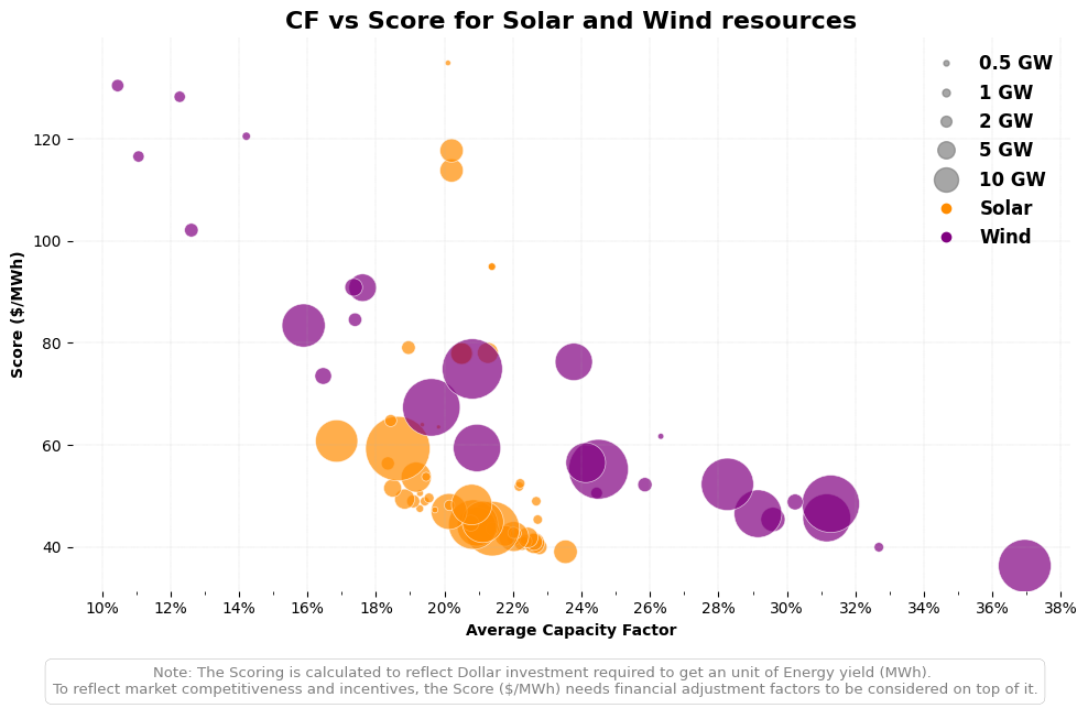
# Example of correct argument dictionary (if you want to use kwargs)
scatter_plot_args = {
"solar_clusters": clusters_solar,
"wind_clusters": clusters_wind,
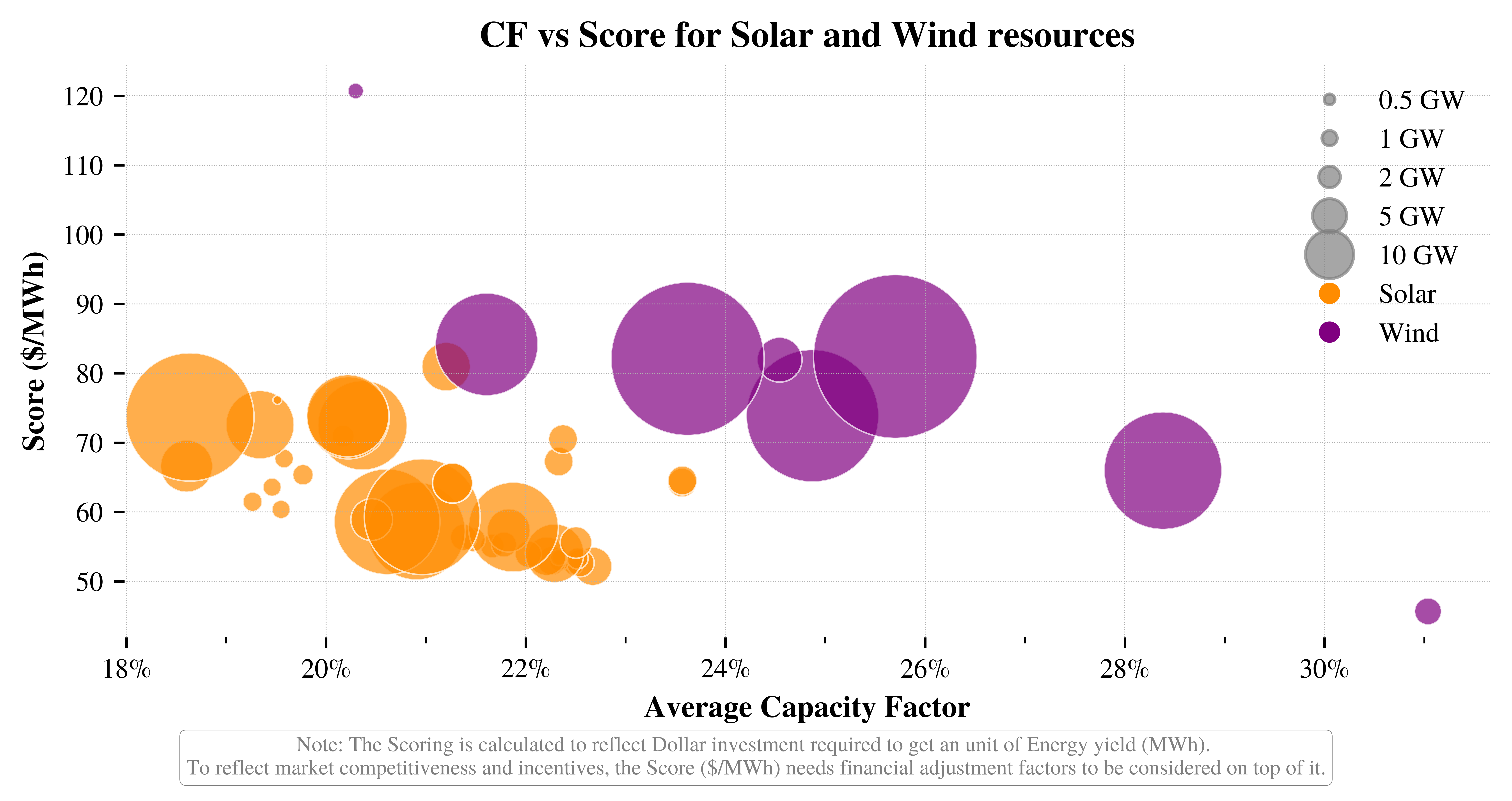
"bubbles_GW": [0.5, 1, 2, 5, 10], # bubble sizes in GW
"bubbles_scale": 0.025, #100 times smaller than the original scale
"lcoe_threshold": 130, # LCOE threshold in $/MWh
"figsize": (7, 3.5), # Adjusted figure size for publication quality
"dpi":1000,
"save_to_root": f"../vis/{region_code}",
}
# Call the function using the argument dictionary
vis.plot_resources_scatter_metric_combined(**scatter_plot_args)
└> Combined CF vs LCOE plot created and saved to: ../vis/BC/Resources_CF_vs_LCOE_combined.png
CF checks#
[ ]:
gwa_country_code=cfg.get('region_mapping').get(region_code).get('GWA_country_code')
utils.print_banner(f"GWA Country Code Selected: {gwa_country_code}")
******************************
GWA Country Code Selected: CAN
******************************
Wind#
[ ]:
# Get total bounds from boundary GeoDataFrame
minx, miny, maxx, maxy = boundary.total_bounds

# Create bounding_box_dict with correct keys for downstream use
bounding_box_dict = {
    "minx": float(minx),
    "miny": float(miny),
    "maxx": float(maxx),
    "maxy": float(maxy)
}
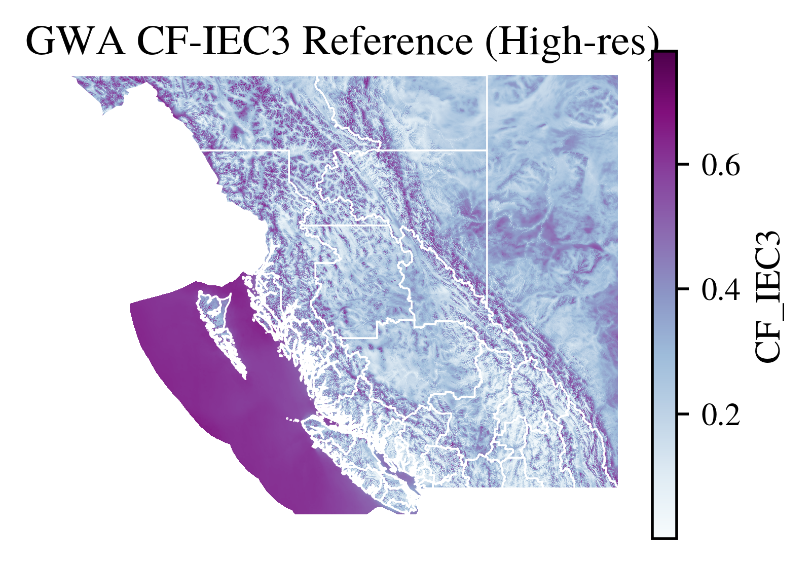
[ ]:
import rioxarray as rxr

raster_path=f'../data/downloaded_data/GWA/{gwa_country_code}_capacity-factor_IEC3.tif'
gwa_raster_data = (
        rxr.open_rasterio(raster_path)
        .rio.clip_box(**bounding_box_dict)
        .rename('CF_IEC3')
        .drop_vars(['band', 'spatial_ref'])
        .isel(band=1 if '*Class*' in 'CF_IEC3' else 0)  # 'IEC_Class_ExLoads' data is in band 1
    )
[ ]:
import matplotlib.pyplot as plt

fig, ax = plt.subplots(figsize=(3.5, 2.5),dpi=500)
gwa_raster_data.plot(ax=ax, cmap='BuPu', add_colorbar=True)
boundary.plot(ax=ax, facecolor='none', edgecolor='white', linewidth=0.5)
ax.set_title("GWA CF-IEC3 Reference (High-res)")
ax.axis('off')
plt.savefig(f"../vis/{region_code}/GWA_CF_IEC3.png", bbox_inches='tight', transparent=False)
[ ]:
vis.get_CF_wind_check_plot(cells,
                       gwa_raster_data,
                       boundary,
                       region_code,
                       region_name,
                       ['CF_IEC3', 'wind_CF_mean'],
                       figure_height=5,)
---------------------------------------------------------------------------
NameError                                 Traceback (most recent call last)
Cell In[21], line 2
      1 vis.get_CF_wind_check_plot(cells,
----> 2                        gwa_raster_data,
      3                        boundary,
      4                        region_code,
      5                        region_name,
      6                        ['CF_IEC3', 'wind_CF_mean'],
      7                        figure_height=5,)

NameError: name 'gwa_raster_data' is not defined
[ ]:
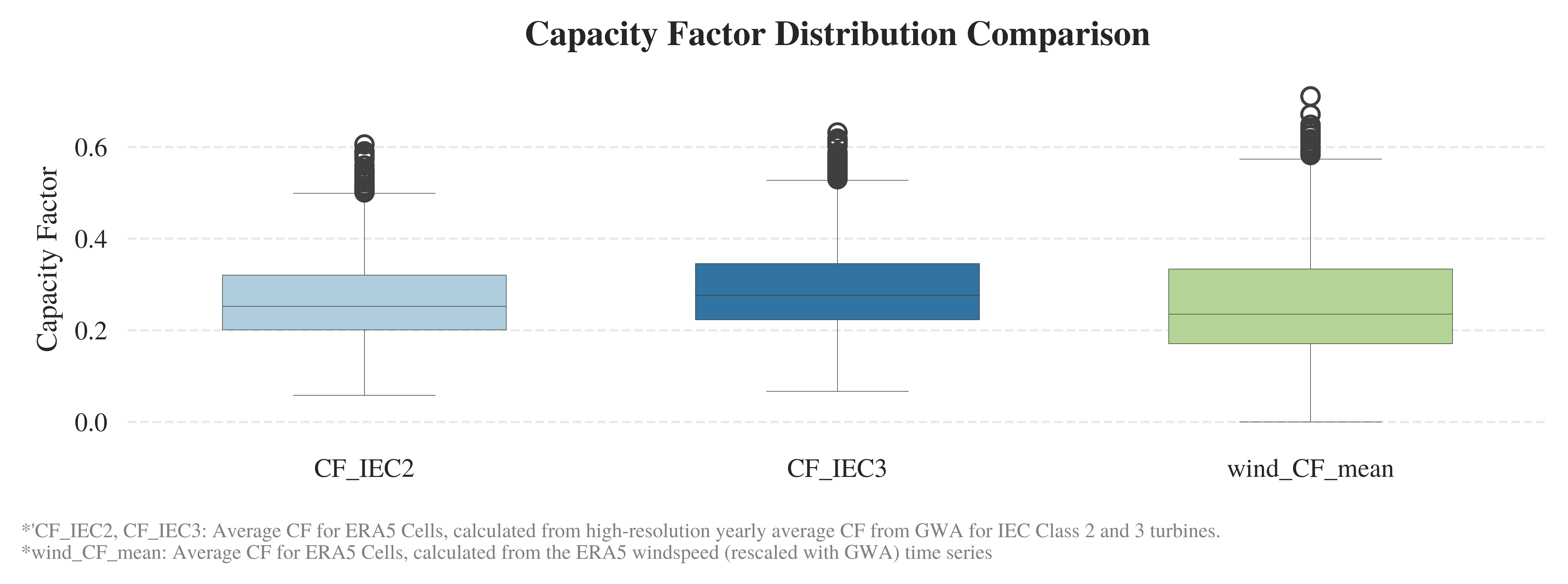
import seaborn as sns
import matplotlib.pyplot as plt

# Set a clean and minimal style
sns.set_style("white")

# Initialize the figure
plt.figure(figsize=(7.5, 2.5),dpi=1000)
plt.style.use('../RES/visual_styles/elsevier.mplstyle')

# Create the boxplot
ax = sns.boxplot(
    data=cells[['CF_IEC2', 'CF_IEC3', 'wind_CF_mean']],
    palette="Paired",
    linewidth=0.2,
    width=0.6
)

# Set title and labels
ax.set_title('Capacity Factor Distribution Comparison', weight='semibold', pad=12)
ax.set_ylabel('Capacity Factor')
ax.set_xlabel('')

# Tweak tick formatting
ax.tick_params(axis='x')
ax.tick_params(axis='y')

# Remove all spines
for spine in ax.spines.values():
    spine.set_visible(False)

# Add horizontal grid lines
ax.yaxis.grid(True, linestyle='--', alpha=0.4)
ax.xaxis.grid(False)

plt.figtext(
    0.01, -0.08,
    "*'CF_IEC2, CF_IEC3: Average CF for ERA5 Cells, calculated from high-resolution yearly average CF from GWA for IEC Class 2 and 3 turbines.\n"
    "*wind_CF_mean: Average CF for ERA5 Cells, calculated from the ERA5 windspeed (rescaled with GWA) time series ",
    ha='left', fontsize=7, style='normal', fontweight='normal', color='gray',wrap=True
)

plt.tight_layout()
plt.savefig(f"../vis/{region_code}/CF_distribution_comparison.png", bbox_inches='tight', transparent=False)
Solar
CLusters#
[ ]:
clusters_wind_f=clusters_wind[clusters_wind['potential_capacity']>0]
clusters_solar_f=clusters_solar[clusters_solar['potential_capacity']>0]
[ ]:
print(f'Total sites {len(clusters_wind_f)}')
total_capacity=clusters_wind_f.potential_capacity.sum()
print(f'Total Capacity {int(total_capacity/1E3)} GW')
sites=5
top_sites_capacity=clusters_wind_f.head(sites).potential_capacity.sum()
print(f'Top {sites} sites ({round(sites/len(clusters_wind_f)*100)}% site) capacity {int(top_sites_capacity/1E3)} GW ({round(top_sites_capacity/total_capacity*100)}% of total capacity)')
Total sites 31
Total Capacity 666 GW
Top 5 sites (16% site) capacity 248 GW (37% of total capacity)
[ ]:
print(f'Total sites {len(clusters_solar_f)}')
total_capacity=clusters_solar_f.potential_capacity.sum()
print(f'Total Capacity {int(total_capacity/1E3)} GW')
sites=5
top_sites_capacity=clusters_solar_f.head(sites).potential_capacity.sum()
print(f'Top {sites} sites ({round(sites/len(clusters_solar_f)*100)}% site) capacity {int(top_sites_capacity/1E3)} GW ({round(top_sites_capacity/total_capacity*100)}% of total capacity)')
Total sites 53
Total Capacity 523 GW
Top 5 sites (9% site) capacity 16 GW (3% of total capacity)
Static Plots#
[ ]:
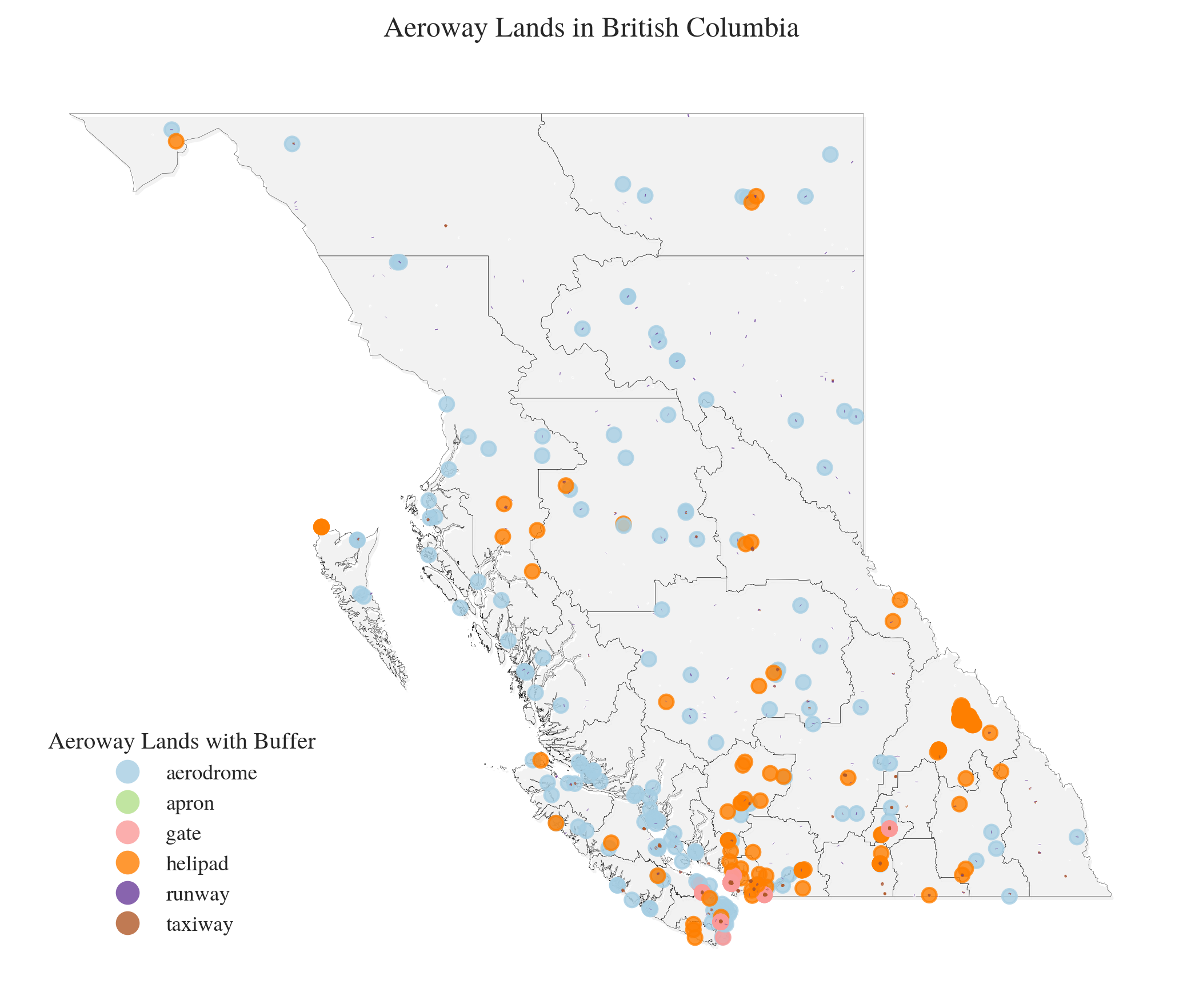
aeroway=gpd.read_file(f'../data/downloaded_data/OSM/{region_code}_aeroway.geojson')
/localhome/mei3/miniconda3/envs/RES/lib/python3.12/site-packages/pyogrio/raw.py:196: RuntimeWarning: Several features with id = 1374701 have been found. Altering it to be unique. This warning will not be emitted anymore for this layer
  return ogr_read(
[ ]:
import matplotlib.pyplot as plt
fig, ax = plt.subplots(figsize=(7, 6), dpi=300)
plt.style.use('../RES/visual_styles/elsevier.mplstyle')

shadow_offset=0.05
# Plot boundary with subtle shadow effect
boundary.geometry = boundary.geometry.translate(xoff=shadow_offset, yoff=-shadow_offset)
boundary.plot(ax=ax, facecolor='grey', edgecolor='lightgray', linewidth=0.1, alpha=0.1)
boundary.geometry = boundary.geometry.translate(xoff=-shadow_offset, yoff=shadow_offset)
boundary.plot(ax=ax, facecolor='none', edgecolor='k', linewidth=0.1, alpha=1)

# Plot aeroway data
aeroway.plot(
    column='aeroway',
    ax=ax,
    legend=True,
    legend_kwds={
        'title': "Aeroway Lands with Buffer",
        'loc': 'lower left',
        'bbox_to_anchor': (0.01, 0.04),
        'frameon': False
    },
    alpha=0.8,
    cmap='Paired'
)

# Clean up plot
ax.set_title(f"Aeroway Lands in {region_name}", pad=15)
ax.axis('off')
plt.tight_layout()
plt.savefig(f'../vis/{region_code}/misc/Aeroway_{region_name}.png')
plt.show()
[ ]:
import matplotlib.pyplot as plt
import seaborn as sns
# Set Seaborn style for better aesthetics
sns.set_style("whitegrid")
# Create figure
fig, ax = plt.subplots(figsize=(10, 5), dpi=300)
plt.style.use('../RES/visual_styles/elsevier.mplstyle')
# fig, ax = plt.subplots(figsize=(20, 4), facecolor="#f9f9f9") # Light background
# Define custom colors
colors = ['#1f77b4', '#ff6347']
# Plot using Seaborn
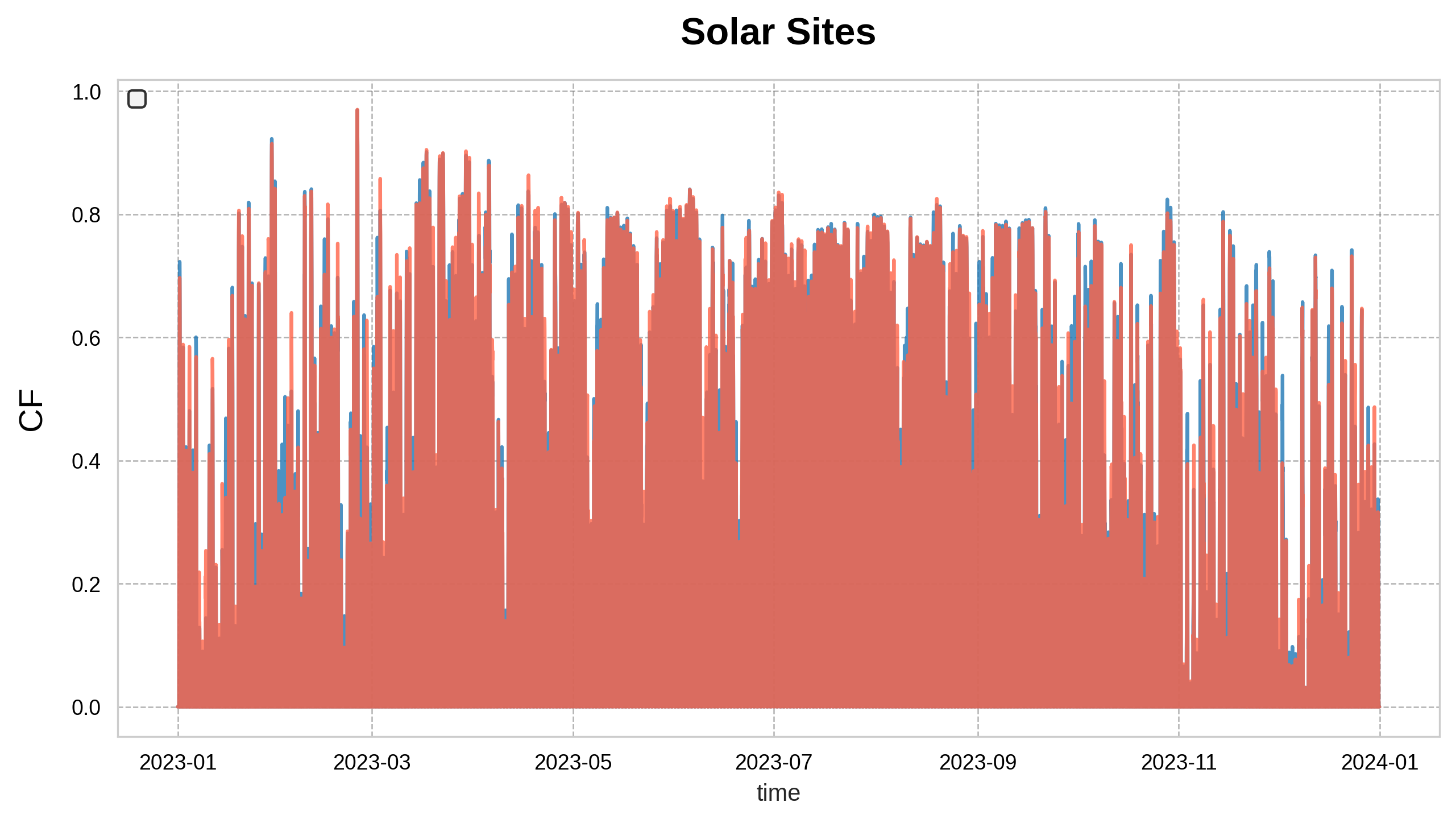
sns.lineplot(data=timeseries_clusters_solar, x=timeseries_clusters_solar.index, y=timeseries_clusters_solar.iloc[:, 0], ax=ax, color=colors[0], linewidth=1.5, alpha=0.8, )
sns.lineplot(data=timeseries_clusters_solar, x=timeseries_clusters_solar.index, y=timeseries_clusters_solar.iloc[:, 1], ax=ax, color=colors[1], linewidth=1.5, alpha=0.8,)
# Enhance aesthetics
ax.set_facecolor("#ffffff") # Pure white plot area
ax.grid(True, linestyle="--", linewidth=0.6, alpha=0.6, color="gray")
# Labels & title
ax.set_title("Solar Sites", fontsize=16, color="black", fontweight="bold", pad=15)
# ax.set_xlabel("Time", fontsize=14, color="black", labelpad=10)
ax.set_ylabel("CF", fontsize=14, color="black", labelpad=10)
# Customize ticks
ax.tick_params(axis='x', colors="black")
ax.tick_params(axis='y', colors="black")
# Add a legend
ax.legend(facecolor="#f0f0f0", edgecolor="black", loc="upper left", frameon=True)
# Show plot
plt.show()
[ ]:
# import matplotlib.pyplot as plt
# import seaborn as sns

# # Set Seaborn style for better aesthetics
# sns.set_style("whitegrid")

# # Create figure
# fig, ax = plt.subplots(figsize=(20, 4.5), facecolor="#f9f9f9")  # Light background

# # Define custom colors
# colors = ['#1f77b4', '#ff6347']

# # Plot using Seaborn
# sns.lineplot(data=timeseries_clusters_wind, x=timeseries_clusters_wind.index, y='Capital_1', ax=ax, color=colors[0], linewidth=1.5, alpha=0.8, label="Capital 1")
# sns.lineplot(data=timeseries_clusters_wind, x=timeseries_clusters_wind.index, y='PeaceRiver_1', ax=ax, color=colors[1], linewidth=1.5, alpha=0.8, label="Peace River 1")

# # Enhance aesthetics
# ax.set_facecolor("#ffffff")  # Pure white plot area
# ax.grid(True, linestyle="--", linewidth=0.6, alpha=0.6, color="gray")

# # Labels & title
# ax.set_title("Wind Sites", fontsize=16, color="black", fontweight="bold", pad=15)
# # ax.set_xlabel("Time", fontsize=14, color="black", labelpad=10)
# ax.set_ylabel("CF", fontsize=14, color="black", labelpad=10)

# # Customize ticks
# ax.tick_params(axis='x', colors="black", labelsize=12)
# ax.tick_params(axis='y', colors="black", labelsize=12)

# # Add a legend
# ax.legend(facecolor="#f0f0f0", edgecolor="black", fontsize=12, loc="upper left", frameon=True)

# # Show plot
# plt.show()
Static Data Visuals in Interactive Maps#
[ ]:
"""
import hvplot.pandas
import holoviews as hv
from holoviews import opts
from bokeh.layouts import gridplot
from bokeh.io import show

# Initialize Holoviews extension
hv.extension('bokeh')


# Define a dictionary to map columns to specific colormaps
cmap_mapping = {
    'lcoe_wind': 'cool',
    'potential_capacity_wind': 'Blues',
    'lcoe_solar': 'autumn',
    'CF_IEC2': 'RdYlGn',
    'wind_CF_mean': 'RdYlGn',
    'windspeed_ERA5': 'winter',
    'nearest_station_distance_km': 'Oranges',
    'potential_capacity_wind': 'Blues',
    'potential_capacity_solar': 'Oranges',
}

# Define a function to create individual plots
def create_plot(column_name, cmap):
    return cells.hvplot(
        color=column_name,
        cmap=cmap,
        geo=True,
        tiles='CartoDark',  # Default base map
        frame_width=300,  # Adjust the size of the plots
        frame_height=300,  # Adjust the size of the plots
        data_aspect=.5,
        alpha=0.8,
        line_color='None',
        line_width=0.1,
        hover_line_color='red'
    ).opts(title=column_name,
            show_grid=True,
            show_legend=True,
            tools=['hover', 'pan', 'wheel_zoom','reset','box_select'],
            legend_position='top_right'
        )

# Create a list of plots for each column
plots = [create_plot(col, cmap) for col, cmap in cmap_mapping.items()]

# Create a grid layout for the plots
grid = hv.Layout(plots).cols(3)  # Adjust the number of columns as needed

# Show the layout
hv.save(grid, 'docs/grid_plots.html')  # Save the grid layout as an HTML file


# Render the layout as a Bokeh object
bokeh_layout = hv.render(grid, backend='bokeh')

# Show the layout
show(bokeh_layout)
"""
Timeseries Plots#
[ ]:
# import pandas as pd
# import hvplot.pandas
# import panel as pn
# import random

# # Initialize Panel with the dark theme
# pn.extension(theme='default')

# # Load your DataFrames
# df_solar = timeseries_clusters_solar  # Your solar DataFrame
# df_wind = timeseries_clusters_wind    # Your wind DataFrame

# # Create a list of the column names for the dropdowns
# solar_options = df_solar.columns.tolist()
# wind_options = df_wind.columns.tolist()

# # Function to generate a random vibrant color
# def get_random_vibrant_color():
#     return "#{:02x}{:02x}{:02x}".format(random.randint(150, 255), random.randint(150, 255), random.randint(150, 255))


# # Create a function to update the solar plot based on the selected time series
# def update_solar_plot(selected_series):
#     return df_solar[selected_series].hvplot.line(
#         title=f"Time Series - Solar: {selected_series}",
#         xlabel="DateTime",
#         ylabel="Value",
#         legend='top_left',
#         width=1000,  # Width of the plot
#         height=200,  # Height of the plot
#         tools=['hover'],  # Enable hover tool
#         line_color=get_random_vibrant_color()  # Random vibrant color for the solar plot
#     )

# # Create a function to update the wind plot based on the selected time series
# def update_wind_plot(selected_series):
#     return df_wind[selected_series].hvplot.line(
#         title=f"Time Series - Wind: {selected_series}",
#         xlabel="DateTime",
#         ylabel="Value",
#         legend='top_left',
#         width=1000,  # Width of the plot
#         height=200,  # Height of the plot
#         tools=['hover'],  # Enable hover tool
#         line_color=get_random_vibrant_color()  # Random vibrant color for the wind plot
#     )

# # Create dropdown widgets for selecting the time series
# solar_dropdown = pn.widgets.Select(name='Select Solar Time Series', options=solar_options)
# wind_dropdown = pn.widgets.Select(name='Select Wind Time Series', options=wind_options)

# # Create dynamic panels that update the plot based on the dropdown selections
# dynamic_solar_plot = pn.bind(update_solar_plot, selected_series=solar_dropdown)
# dynamic_wind_plot = pn.bind(update_wind_plot, selected_series=wind_dropdown)

# # Create a layout with the dropdowns and the plots in a two-row grid
# grid_layout = pn.Column(
#     solar_dropdown, dynamic_solar_plot,  # Solar plot in the first row
#     wind_dropdown, dynamic_wind_plot     # Wind plot in the second row
# )

# # Save the grid layout as an HTML file
# grid_layout.save('../docs/time_series_plots.html')

# # Display the panel in a notebook or in a web application
# grid_layout.show()
[ ]:
# import pandas as pd
# import hvplot.pandas
# import panel as pn
# import random

# # Initialize Panel with the dark theme
# pn.extension(theme='default')

# # Load your DataFrames
# df_solar = timeseries_clusters_solar  # Your solar DataFrame
# df_wind = timeseries_clusters_wind    # Your wind DataFrame
# clusters_solar = clusters_solar       # Your clusters_solar DataFrame

# # Create a list of the column names for the dropdowns
# solar_options = df_solar.columns.tolist()
# wind_options = df_wind.columns.tolist()

# # Function to generate a random vibrant color
# def get_random_vibrant_color():
#     return "#{:02x}{:02x}{:02x}".format(random.randint(150, 255), random.randint(150, 255), random.randint(150, 255))

# # Create a function to update the solar plot based on the selected time series
# def update_solar_plot(selected_series):
#     return df_solar[selected_series].hvplot.line(
#         title=f"Time Series - Solar: {selected_series}",
#         xlabel="DateTime",
#         ylabel="Value",
#         legend='top_left',
#         width=1000,  # Width of the plot
#         height=300,  # Increased height for better visibility
#         tools=['hover'],  # Enable hover tool
#         line_color=get_random_vibrant_color(),  # Random vibrant color for the solar plot
#         line_width=2,  # Make line thicker for better visibility
#         fontsize={'title': 16, 'xlabel': 14, 'ylabel': 14, 'legend': 12},  # Adjust font sizes
#     )

# # Create a function to update the wind plot based on the selected time series
# def update_wind_plot(selected_series):
#     return df_wind[selected_series].hvplot.line(
#         title=f"Time Series - Wind: {selected_series}",
#         xlabel="DateTime",
#         ylabel="Value",
#         legend='top_left',
#         width=1000,  # Width of the plot
#         height=300,  # Increased height for better visibility
#         tools=['hover'],  # Enable hover tool
#         line_color=get_random_vibrant_color(),  # Random vibrant color for the wind plot
#         line_width=2,  # Make line thicker for better visibility
#         fontsize={'title': 16, 'xlabel': 14, 'ylabel': 14, 'legend': 12},  # Adjust font sizes
#     )

# # Create dropdown widgets for selecting the time series
# solar_dropdown = pn.widgets.Select(name='Select Solar Time Series', options=solar_options, width=300)
# wind_dropdown = pn.widgets.Select(name='Select Wind Time Series', options=wind_options, width=300)


# # Create dynamic panels that update the plot based on the dropdown selections
# dynamic_solar_plot = pn.bind(update_solar_plot, selected_series=solar_dropdown)
# dynamic_wind_plot = pn.bind(update_wind_plot, selected_series=wind_dropdown)

# # Function to get relevant row data from clusters_solar
# def get_cluster_info(selected_series):
#     # Use the selected series name to find the relevant row in clusters_solar
#     selected_row = clusters_solar.loc[selected_series]
#     return selected_row

# # Create a function to update the table based on the selected time series
# def update_cluster_table(selected_series):
#     cluster_info = get_cluster_info(selected_series)

#     # Drop the geometry column if it exists
#     if 'geometry' in cluster_info.index:
#         cluster_info = cluster_info.drop('geometry')

#     # Return the DataFrame widget without the geometry column
#     return pn.widgets.DataFrame(cluster_info.to_frame().T, width=800, height=200)


# # Create dynamic panels for the table
# dynamic_cluster_table = pn.bind(update_cluster_table, selected_series=solar_dropdown)

# # Adjust the overall layout for better alignment and spacing
# grid_layout = pn.Column(
#     pn.Row(solar_dropdown, dynamic_solar_plot, align="center"),  # Center align solar dropdown and plot
#     pn.Row(dynamic_cluster_table),  # Show the table below the solar plot
#     pn.Row(wind_dropdown, dynamic_wind_plot, align="center"),    # Center align wind dropdown and plot
#     sizing_mode='stretch_width',  # Make layout responsive to different screen sizes
#     width=1100,  # Set a consistent width for the layout
#     height=900   # Adjust height to give more space for plots
# )

# # Save the grid layout as an HTML file
# grid_layout.save('../docs/time_series_plots_with_table.html')

# # Display the panel in a notebook or in a web application
# grid_layout.show()